
 English
 中文简体
中文简体 Español
A Cute Cartoon Bottle does not have one fixed appearance. An animal design may favor rounded proportions, while a space-themed bottle may use a more streamlined body and contrasting colors. A children's design may focus on friendly expressions and simplified shapes. The character direction chosen at the start of development shapes almost every decision that follows, from body silhouette down to how the lid gets styled.
Different Characters Create Different Product Directions
The Cute Cartoon Bottle category can cover a broad range of product concepts without requiring every design to follow the same bottle structure.
| Character Direction | Possible Bottle Expression |
|---|---|
| Animal theme | Rounded body and friendly proportions |
| Space theme | Futuristic colors and streamlined details |
| Children's character | Simplified shapes and expressive graphics |
| Cartoon mascot | Strong silhouette and recognizable colors |
This variety explains why character drinkware can involve more than selecting a printed pattern. The physical proportions can be adjusted to support the intended theme, while the basic drinking function remains intact underneath whatever shape the character direction calls for. A monkey-themed bottle built around a rounded, big-bellied silhouette communicates its character before a customer ever looks at the printed graphics, while a space-themed bottle relies more on color gradient and a streamlined profile to carry that same visual identity.
Bottle Structure And Character Expression Work Together
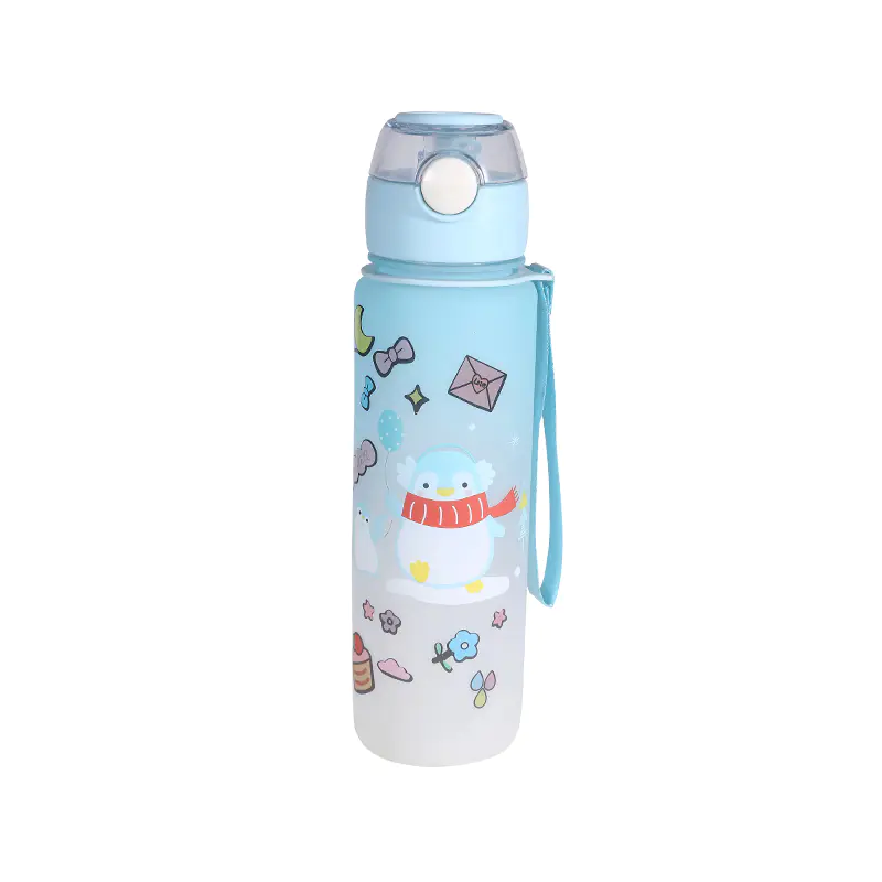
Deciding how much of a character comes through the physical shape versus the surface graphics is one of the earlier calls made during development of a Cute Cartoon Bottle concept. A design that leans on shape, like a rounded animal silhouette or an exaggerated proportion tied to a mascot, reads as that character even from a distance or in a low-detail thumbnail image, which matters for retail listings where a small product photo has to communicate the concept quickly. A design that leans more on surface graphics keeps the underlying bottle structure closer to a standard shape, which can simplify tooling if the same body needs to support several different printed themes across a product line. Neither approach is inherently better suited to every project; the right balance depends on whether a buyer wants a single standout shape or a flexible body that supports rotating seasonal artwork.
Customization Extends Beyond Artwork
For buyers developing a Cute Cartoon Bottle, customization can begin with an existing bottle structure or start from a customer concept. Kaixuan states that its plastic water bottles can be customized according to customer requirements and that the company provides OEM and ODM production for sports water bottles. The company's product range provides several examples of character-oriented drinkware, including children's cartoon designs and a plastic cartoon monkey sports bottle. These products show how different themes can be applied to plastic bottle collections rather than relying on one standard appearance.
For a Cute Cartoon Bottle, the initial product concept can include the character theme, bottle proportions, lid appearance, color arrangement, and graphic treatment together. Working through these elements as a set, rather than finalizing a bottle shape early and treating the character as a decoration applied afterward, gives the manufacturer a clearer understanding of whether the character should be expressed mainly through the bottle shape, the surface design, or a combination of both. Lid design plays a specific role in that combination too, since a rounded cap or an exaggerated closure shape can extend a character's silhouette upward in a way flat artwork alone cannot achieve.
As character drinkware develops, the distinction between a standard bottle with cartoon printing and a purpose-designed Cute Cartoon Bottle becomes more visible on the shelf. A bottle that uses its physical form as part of the visual message gives buyers another direction to consider when developing children's drinkware, themed merchandise, and character-based product collections, alongside the more familiar approach of applying artwork to an existing standard shape.
