
 English
 中文简体
中文简体 Español
A gradient color bottle rarely attracts attention because of its shape alone.
People often notice the color.
The same bottle may appear brighter near a window, softer under indoor lighting, or slightly different when carried outdoors. These changes are common in everyday use, yet they are frequently discussed during product development because appearance influences how customers experience the product after purchase.
Inside manufacturing workshops, another topic often appears alongside color discussions: surface color transition. Instead of focusing on decoration, production teams compare how consistent the finish remains from one manufacturing batch to another.
Lighting Changes The Same Bottle
Morning sunlight creates one effect.
Office lighting creates another.
Store displays add their own reflections.
The bottle itself has not changed.
The surrounding environment has.
During product reviews, designers sometimes place a gradient color bottle beneath several light sources before approving a production sample. The goal is observation rather than comparison.
Small Color Differences Become Easier To Notice
One bottle looks acceptable by itself.
Several bottles placed together tell a different story.
A gradual transition appears smoother on one sample.
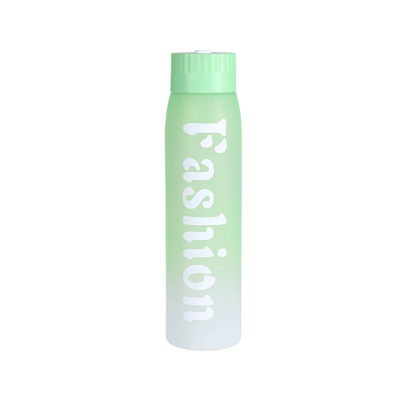
Another develops a slightly stronger color boundary.
These details usually receive attention during quality inspection because customers often see multiple products displayed side by side.
Production records related to surface color transition frequently include these observations.
Production Samples Are Compared Together
Inspection tables rarely contain only one sample.
Reference pieces remain nearby.
Recently completed batches are added.
Engineers move products under different lighting before making notes.
The discussion surrounding a gradient color bottle often begins with visual consistency instead of production quantity.
Daily Use Adds Another Perspective
A bottle carried outdoors experiences changing conditions throughout the day.
Direct sunlight.
Cloud cover.
Indoor storage.
Evening exercise.
Each environment influences how the color is perceived.
Customer feedback collected after product launches sometimes mentions these visual differences without referring to manufacturing processes. Those comments later become useful references during surface color transition reviews.
Designers Observe More Than Color
Appearance involves several details working together.
Gloss level.
Edge definition.
Transition smoothness.
Surface reflection.
Rather than evaluating these items separately, product teams usually observe the complete appearance of a gradient color bottle while rotating it under steady lighting.
Display Shelves Create Different Impressions
Retail environments vary.
Some stores use warm lighting.
Others install bright white LEDs.
Display height also changes how customers first notice the product.
Because of this, merchandising teams occasionally photograph the same gradient color bottle in several display environments before selecting promotional materials.
Manufacturing Notes Stay Practical
Workshop records rarely describe color with complicated language.
Instead, they contain short observations.
"Transition appears uniform."
"Reference sample checked."
"Visual comparison completed."
These simple notes gradually document how each production batch develops.
Engineers reviewing surface color transition often compare these records before approving future manufacturing runs.
Every Production Batch Becomes Another Reference
No production line depends on a single sample.
Reference bottles remain available.
New batches arrive.
Finished products are placed beside earlier production.
The comparison continues throughout routine quality inspections, allowing each gradient color bottle to become part of an ongoing visual record rather than an isolated product review.
