 English
 中文简体
中文简体 Español
Walk into any gym or scan a hydration hashtag on Instagram. You will spot them everywhere. A gradient color bottle shifts from pink to orange, blue to purple, or green to yellow. They look like digital art you can hold. People buy them for the looks. But they keep buying them because the design actually works. Here is why retailers and younger shoppers cannot get enough.
Trend or Here to Stay?
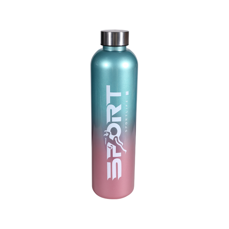
Some color trends fade fast. Neon was everywhere in the 80s. Pastels had their moment. A gradient color bottle feels different because the transition creates something unique every time you look at it. One angle shows more blue. Another angle brings out the violet.
Factories like KX Bottle use PC material for these bottles. PC is tough. Drop it on concrete, and it bounces instead of cracking. That matters because a gradient color bottle gets carried everywhere. To the climbing gym. On a road trip. Across campus between classes. Nobody wants a pretty bottle that shatters on the first fall.
The bounce cover lid also helps. Flip it open with one thumb. No screwing, no lining up threads. That sounds small until you try drinking mid-workout or while driving.
Retailers Looking for the Next Big Thing
Store buyers watch TikTok and Instagram for what teens and college students actually use. Right now, a gradient color bottle shows up constantly. Bright backgrounds, slow pans across the shifting colors, flat lays with journals and sneakers.
Why this matters for a wholesaler:
- Shelf presence – A rack of solid-colored bottles all looks the same. Gradients grab the eye from across the store.
- Photo appeal – Customers post pictures of their new bottle. That is free advertising.
- Giftability – People buy these for friends because the colors feel special, not generic.
- Set potential – The product page shows a set. Multiple sizes or matching accessories increase average order value.
A gradient color bottle also works for different seasons. Coral to peach for spring. Deep blue to violet for winter. A buyer can rotate color stories without changing the actual product.
Why People Share Their Water Bottles
Nobody posts a picture of a plain, clear bottle. But a gradient color bottle? Different story. The shifting colors look different depending on the light. Morning sun hits it one way. Fluorescent gym lights hit it another way.
People share these bottles because:
The bottle becomes part of their daily aesthetic. It sits next to a laptop, a journal, and a smoothie bowl. The colors tie the whole photo together.
Each bottle feels slightly unique. Mass production is consistent, but the gradient transition varies across the run. Two bottles side by side are not identical.
Hydration tracking turns into content. "Finish this bottle before lunch" is boring. "Watch me finish this gradient bottle" is slightly more interesting.
Younger buyers also use gear to signal taste. A gradient color bottle says "I pay attention to design" without being loud about it. The bottle is functional but also a choice, not a default.
|
Why It Sells |
How the Bottle Delivers |
|
Looks good in photos |
Multi-color transition creates visual interest |
|
Durable enough for daily use |
PC body resists cracks and drops |
|
Easy to drink from |
Bounce cover lid opens with one hand |
|
Works across seasons |
Color mixes match spring, summer, or winter |
|
Fits a set |
Buy multiple sizes or matching lids |
The Social Proof Loop
A gradient color bottle gets noticed in public. Someone sees it on a cafe table and asks where you got it. That conversation happens dozens of times a day across every city. Each talk leads to a search, then a click, then a sale.
Online reviews for gradient bottles often mention "I get compliments every time I carry this." That phrase shows up over and over. It is not about insulation or capacity. It is about how the bottle makes the owner feel when other people react to it.
Retailers should list a gradient color bottle with lifestyle photos. Show it next to a yoga mat. Show it in a car cup holder. Show it on a desk with a laptop open. The buyer imagines owning the whole scene, not just the bottle.
Lightweight Enough to Actually Carry
A metal bottle keeps drinks cold for hours but weighs a ton. A gradient color bottle made from PC is light. Throw it in a tote bag. Clip it to a backpack. Carry it in one finger through the lid loop.
Younger buyers especially hate heavy gear. They already carry a laptop, a charger, a water bottle, and a jacket. Adding a heavy metal bottle makes the bag unbearable. A lightweight gradient color bottle solves that without sacrificing looks.
The bounce cover also means no lost caps. The lid stays attached. One less thing to drop on a dirty floor.
Matching the Set Mentality
The product page mentions a set. That is smart. Once someone buys a gradient color bottle, they want the matching one for a partner or the smaller size for a kid. Some buyers collect the whole color run.
For a retailer, sets increase basket size. A single bottle is an impulse buy. A set is a planned purchase. Display them together. Offer a small discount for buying two.
A gradient color bottle is not just another water bottle. It is a piece of daily gear that people want to show off. The gradient finish hides scratches better than solid colors. The PC material survives real life. The bounce cover lid works one-handed.
For a wholesaler or shop owner, stocking these means betting on social sharing over specs. People do not buy a gradient color bottle because of the insulation numbers. They buy it because it looks good and feels easy. That is enough.